Amateur radio is a popular hobby practiced by about 3 million people world wide. Using several different transmission types, amateurs communicate with each other on a 24/7 basis across the globe. Some of these transmission types would be vaguely familiar to just about everyone on earth. For example, using voice or ‘phone’ as it is called, and a little less-well know is morse code or ‘cw’ mode.
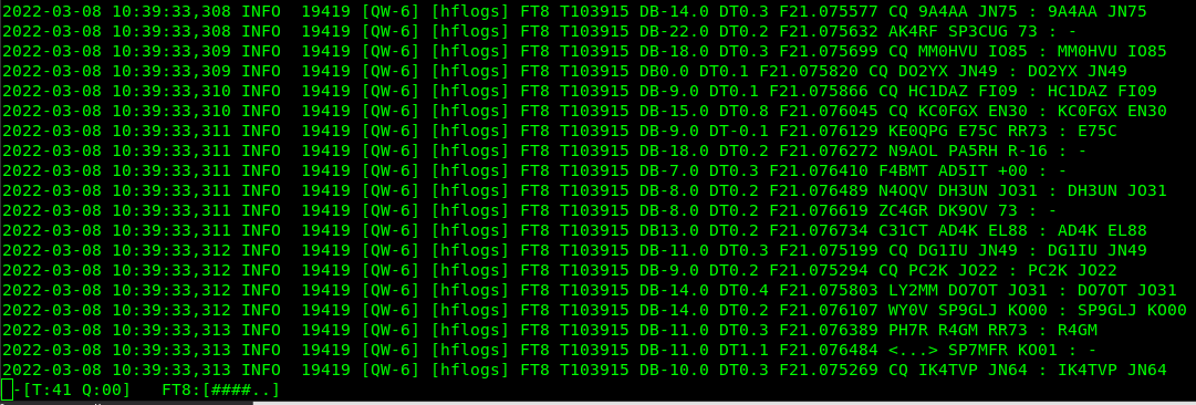
In recent years there has been a rise of various digital modes where text is sent over the air from computer to computer. One particular mode is called FT8, a 15 second burst of information in which a very limited amount of data is transferred. But this method works extremely well in noisy conditions and basically enables reliable world-wide communication depending on time of day and a few other factors. Towards the end of 2021 I began a program of logging every FT8 transmission I could on all HF or High Frequency amateur bands. I will write a detailed description of how in another post (and if this is a link.. then click it! I already have). The most important thing is most of these exchanges between amateurs include a ‘Maidenhead Square’ locator, which is just a combination of letters and numbers that describe a location on earth. Examples from the screen capture below (live from my setup!) are ‘JN75’ which spans the Slovenia/Croatia border and ‘FI09’ which is entirely inside the country of Ecuador but does include its capital, Quito. These are some nice captures by the software ‘Digiskimmer’ from my location here in Boston, MA, USA.
Why do this? Well initially just for fun, maybe study the interplay between enthusiasm for this mode of communication on a day-to-day basis and perhaps see the effects of changes in propagation conditions on what could be heard, when, where from… that sort of thing. Interestingly, the data has turned into a study of amateur radio and current events in Ukraine.
At the beginning of the invasion of Ukraine by Russia at the end of February 2022, Ukrainians were forbidden to use amateur radio — this is a common event during war times, for example amateur radio was strictly forbidden during world war two in all countries involved in the conflict. I wondered, was I able to see a sudden drop in FT8 logs from Ukraine? What about neighbouring countries? Although no rule changes took place in other countries, did they also cease activity? What about the already Russian Occupied regions in Ukraine? Well after about 10 days of data (post invasion) the results are in.
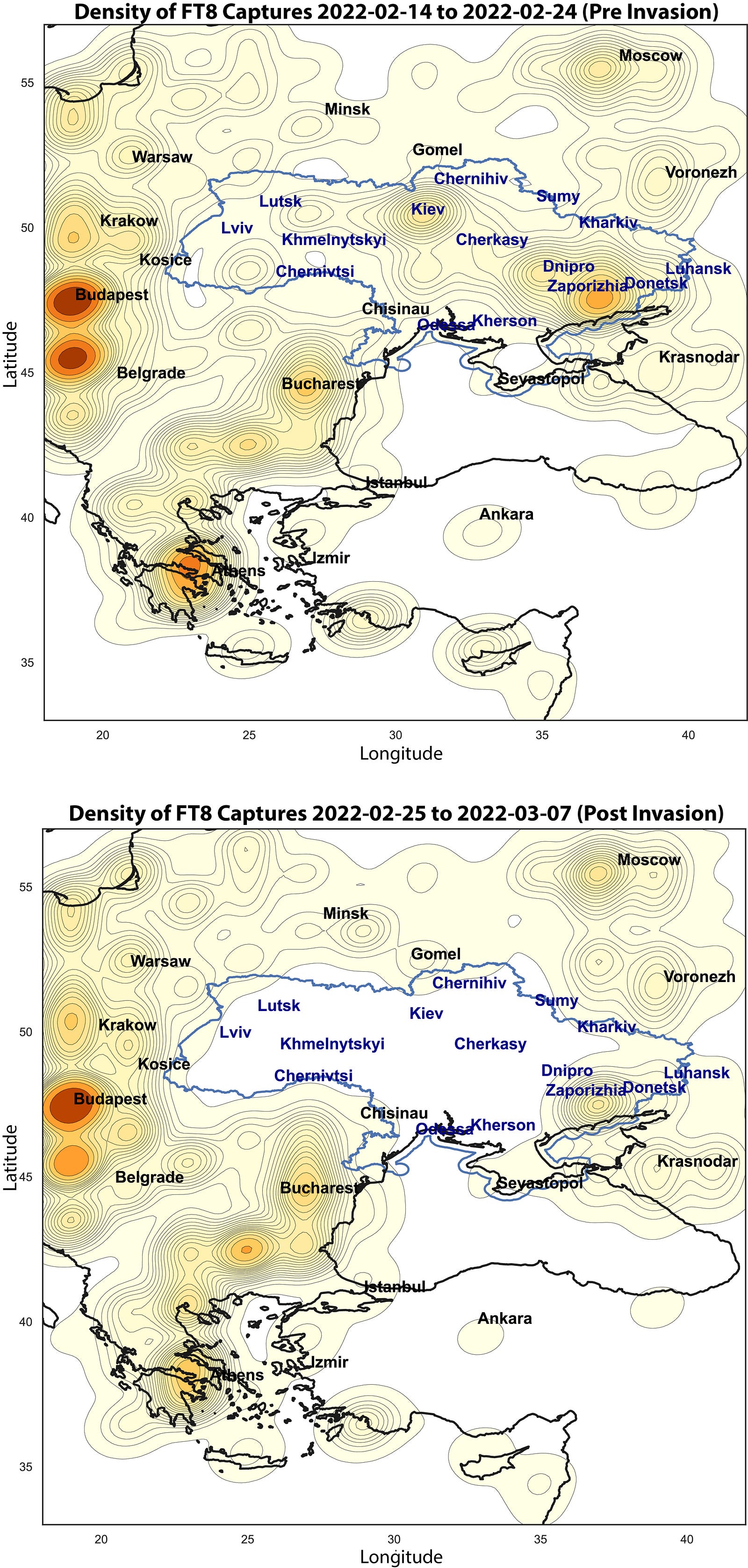
The result is stark, although not surprising. Firstly, the contour lines represent density of transmissions received by my setup from maidenhead squares in the plotted region. The highest density is around Budapest, Hungary, meaning in this plotted area I have received the highest number of transmissions. However, just about all the region plotted is filled with some density of transmissions in the top map (before the conflict). After the beginning of the conflict (bottom map) and the call for amateur radio to cease in Ukraine, Ukraine went dark with the bottom contour line almost exclusively outside the borders of Ukraine. The big exception is the zone near Donetsk, which has been Russian aligned and essentially controlled for some time. Second is the Crimean peninsula with a low level of activity before but also after the start of the conflict. Finally, it is interesting to see little change in activity outside Ukraine.
The most surprising result for me was how well that bottom contour line in the bottom map follows the border of Ukraine, especially in the west. Again these contour lines are developed from a density of signals, but only at the resolution of these maidenhead squares. Each of these maidenhead squares represents 1° of latitude and 2° of longitude but the curve results from a kernel density plot (see here for details). It is not obvious that this kernel density plot would generate a curve that follows the Ukraine border so well, but there you go, it did, with the exception of the Russian controlled east.
I just wanted to quickly write this up, so I have skipped a lot of detail on how these plots are made and how I collect the data. Stay tuned for some more writing on this (hopefully).
Finally, I (partially) apologize for the unusual colour scheme in the map. I tried to use blue and yellow colourings, in honour of the Ukrainian people. Slava Ukraini!